Showing posts with label Concept (Chelsea). Show all posts

Sunday, 9 January 2011

Chelseas finals


As I haven't got all of the images yet I have only been able to complete my edits on the first shoot, so theres a few more to come, but here they are. We decided we all liked the highly saturated, sharp look with a square crop. I also over upped the blacks and the exposure a little to make them a little bolder and sharper.

The first image of Adam I feel is the strongest image and is going to look better in the final set than the second. Due to the eye contact and power behind his eyes.


 The image of Wahid (above) I feel is one of the strongest image from the first shoot, as there seems to be such emotion and thought in his eyes. Although he isn't looking directly into the camera I still think the image could work really well as a final.

 The image of Charlotte (above) I feel was the weakest of the shoot. I don't feel we chose a word that fit her facial shape very well, also I don't think that the orange colour really suits her either. Her expression also isn't as strong. Where as Wahid's image, even though looking away is still strong, I don't feel this one has the same effect.

 I feel this image of Ruth works quite well in the set as she adds diversity and I feel the yellow really suits her face. Although I think it could of been a better shot if we had taken some of her looking at the camera. And the light that is on the bottom of her ear annoys me a little so I feel this lets the shot down.

This final image is my favourite of the shoot. I feel the word we chose 'Brave' really fits the image, and the colours work really well. On this image I also added a bit more exposure to her eyes as the word was so white it dulled her eyes a little, I still think they could be a little brighter but I didn't want to make them look overly edited and fake.

Wednesday, 5 January 2011

Origional Editing Ideas

 For this first image I simply upped the saturation and contrast of the image, I also addded a little more exposure to really brighten it up. I quite like the end result of this one as it makes the word look really bold.

 For this next image I took just the blue saturation of the image down. Although we painted the models in these colours to fit in with our Bloomberg brief, our origional idea was to paint people as different ethnicities and with things such as war paints. I felt this editing technique added a tribal, chalky feel to the shot. Although I wouldn't chose it for a final editing technique.

For this image I took all of the colour saturation out apart from the blues. The reason for this simply to emphasize the colours and boldness of the image. I don't think this would work for our final idea.
For this final editing idea I had, I attempted to smooth out the paint on photoshop. You can see the results better when compared to the original (at the top). This was a first attempt at doing this so it appears a little amature, but I enjoyed testing it out. As our original idea was for tribal paints and such, this editing process doesn't work as well as it takes that raw feel away from it.

Us at work

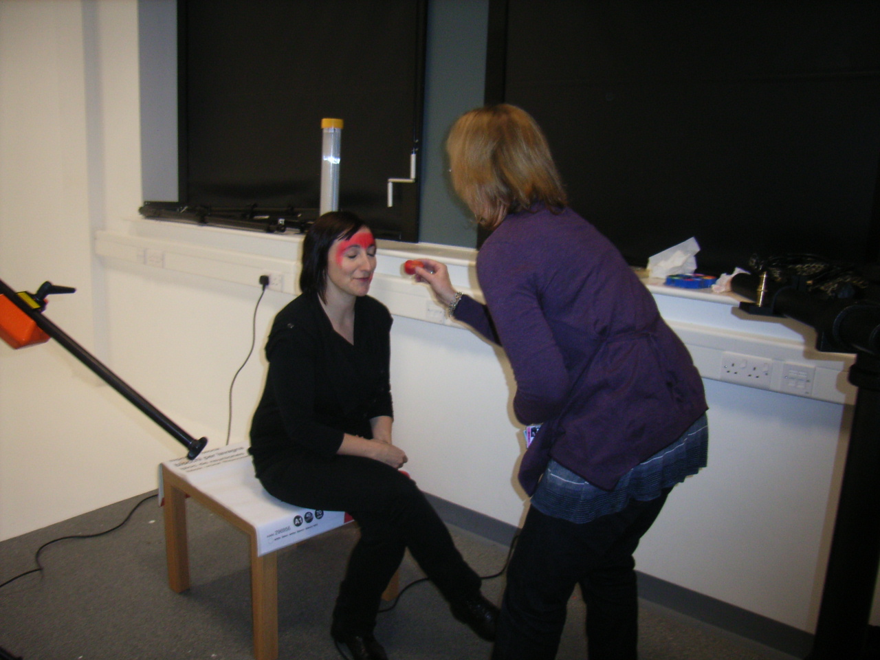
A few shots of us at work in our studio session on Tuesday 4th January.


Chelsea face painting body building model of the day, in a very attractive orange colour!


 Ruth painting Katy, who kindly agreed to help us.

 AnnMarie setting up the projecter and words ready for our models.


 Katy in the hot seat, Chelsea shooting and AnnMarie keeping control of the laptop. Ruth projecting the word on to Katy's face, it has to be held rather than on a table as each model needs the word projected in a specific place to fit their faces.

Thursday, 9 December 2010

Studio session

I'm pretty busy trying to do my essay a the moment so im just going to pop a couple of pictures up so that you can see what we did today, i'll give it a full write up soon!