
Showing posts with label Concept (Ruth). Show all posts
Showing posts with label Concept (Ruth). Show all posts
Thursday, 13 January 2011


Tuesday, 11 January 2011
Selecting final images
We had previously selected one or two images of each model to do trial edits on. From these edited images we chose a full set of 15 images - one for each model. We printed this set out and reviewed them to choose a final set of 8 images that we felt worked well together. We decided to use only images where the model was looking directly at the viewer. Then we chose for a range of paint colours, gender, skin and hair colour and the one's we just felt worked the best.
Here are the team in action (Ruth behind the camera again!):


Here are the team in action (Ruth behind the camera again!):


and the final selection:

Monday, 10 January 2011
Edit of selected images - Ruth
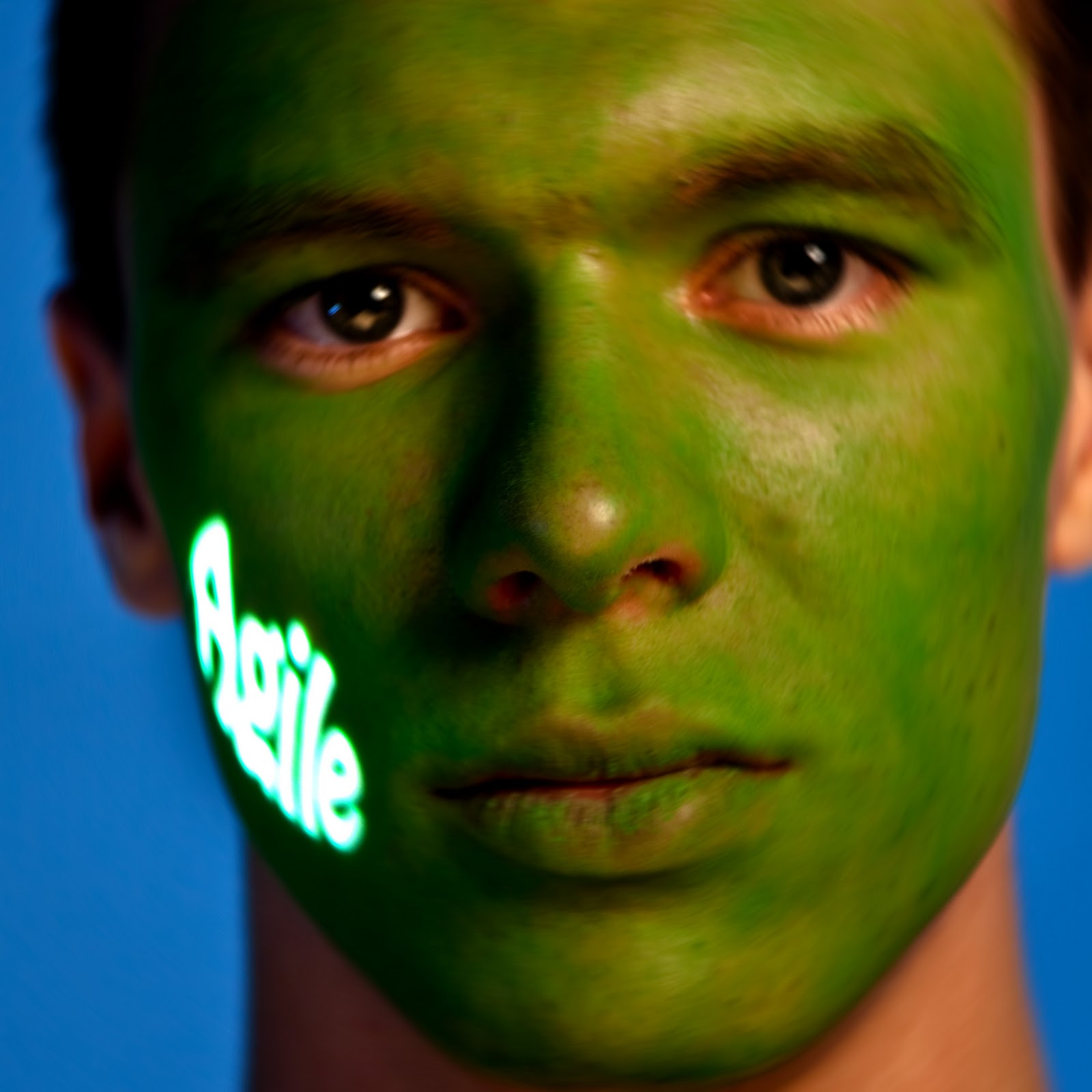
This is my chosen set of edits of the images we selected as a team from the first two shoots plus some images that I selected myself out of the third shoot:


 The images of Charlotte (unique) and Wahid (Active) don't really fit because they are not looking at the viewer. The image of (the first) Adam (driven) would work better with the set if his T-shirt was black. Andy (Robust) is not really sharp enough around the eyes but I chose this image of him because I like the way he is looking at the viewer - its not an issue in the version below with some radial blur added. I picked a different image of Katy (Real) than the one we chose as team as its sharper. The one of Emma (Brave) is the only sample I had - I would have liked one with a bit more of a smile, like one of the images AnnMarie selected.
This is the second set of the same images but with a small amount of radial blur added:


This is the second set of the same images but with a small amount of radial blur added:



Sunday, 26 December 2010
Mock up adverts
Just to see if our images and in particular this square, tight crop would work as an advert. Using text from the Bloomberg website:


Thursday, 23 December 2010
Use of the Bloomberg logo
Bloomberg want to use the images in adverts with their logo on. The brief sets out clear guidlines for how the logo should be applied. I added the logo to some images to see how it would work.
· The Bloomberg logo should be - legible, clear and noticeable against any background.
· The Bloomberg logo should never be placed inside of a holding shape.
· Prefrerred logo colours are WHITE AND YELLOW. These colors can be interchanged based on legibility. BLACK AND GRAY- A black logo should only be used with yellow or white and light photographic backgrounds. A gray logo should only be used on white backgrounds (i.e., stationery).
· The Bloomberg logo can be placed on top of various backgrounds: solid colour, colour gradient mesh, and image
· The logo should be prominent wherever it is used.
· The logo can be used vertically or horizontally. At its maximum size, the logo can be as wide as the format–at a tangent with the format’s edges. Never use the logo at a size smaller than half a format’s width vertically or horizontally
· When the Bloomberg logo is positioned vertically, it should always be reading up (i.e., the “g” should always be at the top).
· Placement of the logo on a page is flexible as long as it is active, impactful and legible. It can be anchored to type but shouldn’t overlap.
· The primary typeface is: BERTHOLD AKZIDENZ GROTESK BOLD
· The secondary font is Arial, bold and regular.
Here are some trial edits. They were all edited in Lightroom as follows:
- Sharpen portrait preset
- Direct positive preset
- Square crop applied
- Clarity and Vibrance increased - each image adjusted individually
Horizontal logo (all half-size)


Vertical logo (large and half-size)


Using a closer cropped image and trying out white writing in full and half size:


Subscribe to:
Posts (Atom)